Geography: Why Doesn't the World Map Show Reality?
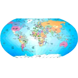
Did you know that the world map we learned about in school does not represent the real size of the continents? The explanation lies in the Mercator Projection, a model created in the 16th century by the cartographer Gerardus Mercator to facilitate maritime navigation. However, this projection distorts the size of countries, enlarging the regions near the poles and reducing areas near the equator. This makes Greenland appear almost the size of Africa, when in reality Africa is 14 times larger. Similarly, Europe appears larger than South America, even though South America is almost twice as large.
This distortion affects not only geography, but also the political and cultural perception of countries around the world. Other projections, such as the Gall-Peters, attempt to correct these errors, but no projection can perfectly represent the Earth, which is spherical, on a flat map. The issue of which map is “wrong” continues to be a debate between cartographers and geographers!
Did you know?


