@Deyse SJ de Assis - Lisboa, Portugal
🧠 Educational content • Interactive quizzes
Mathematics EN 9th grade >>
Extreme and Quartile Diagrams (Boxplot)
What is it?
It's a graph that represents the distribution of a data set using 5 main values:
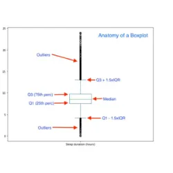
Minimum value
Q1 (1st quartile)
Median (Q2)
Q3 (3rd quartile)
Maximum value
👉 Quickly shows dispersion, symmetry, and possible outliers (extreme values).
📌 How to interpret
The box represents the values between Q1 and Q3 (50% of the data)
The line inside the box is the median (Q2)
The whiskers go from minimum to maximum
If the median is centered → symmetrical distribution
If it is shifted → asymmetrical distribution
📌 Example:
Data: 1, 3, 5, 7, 9.
𝑄1 = 2
𝑄2 = 5
𝑄3 = 8
Minimum = 1, Maximum = 9
👉 The boxplot would be constructed with these 5 values.